We had a great turnout of 33 people at our April Zoom meeting. President, Sandi B. discussed upcoming changes to our CFWS meeting schedules., Starting in September, the first meeting will be on September 20th.
At our May 3rd members meeting:
- Vote on officer nominations for the next season, including Sandi B. for president, Joan L. for vice president, Chelsea C. for treasurer, and Pat Cox B. for secretary.
2. “Share and Care”. Bring a painting, photo or sketch of your latest art project to get ideas, suggestions and other positive feedback from your fellow artists. 😀 Contact Joan L. to get on the list.
3. “Art Supplies Swap”. Look in your closets and under the bed to find any extra supplies laying around. You can sell or donate. Spring cleaning is a good way to make room for new supplies while helping the CFWS with donations!
URGENT: We need volunteers for: sound system management, holiday party coordination, and publicity chairperson.
Remember to pay your membership dues for the 26-27 season. The deadline for members who want to participate in the summer online “Celebration” show is June 1st., the submission will be online. Start planning!
Tips and Tricks from the Watercolor demonstration by Alexis Lavine:
by Lois H.
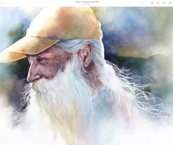
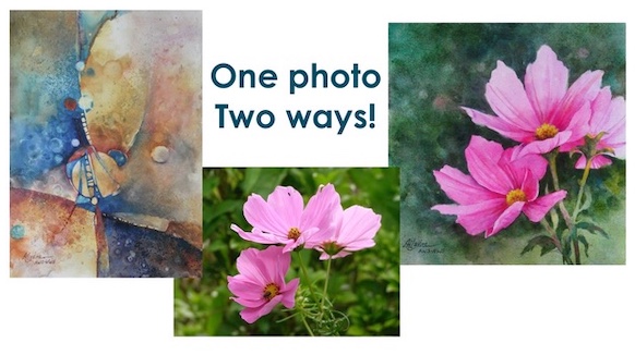
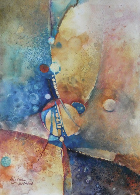
Alexis Lavine, a watercolor artist from North Carolina, conducted a demo on “Bridging Abstraction and Realism”. She demonstrated her process of creating both realistic and abstract paintings from the same photographs.
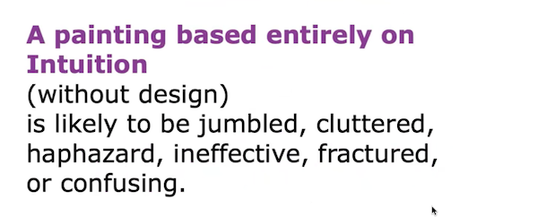
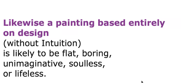
She emphasized the importance of balancing intuition and design in painting, explaining that intuition guides the creative process while design helps organize and arrange elements to create focus and harmony. Intuition gets us started with an idea, story, or feeling. Design pulls it together for a successful finish. Trust your instincts and feelings
Alexis uses selective cropping and different viewing angles to focus on interesting elements.
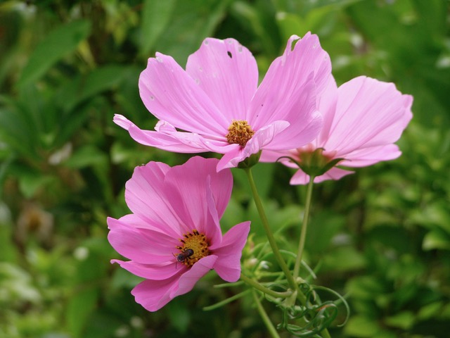
Alexis stressed that photographs should be used for inspiration and ideas rather than for copying.
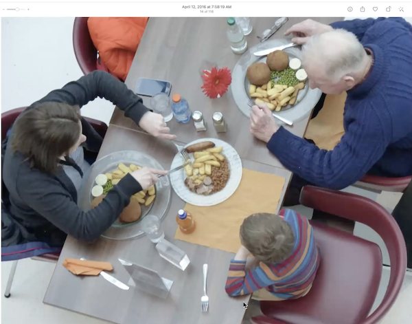
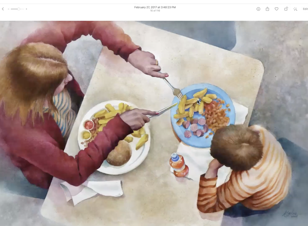
Change the orientation of the painting; horizontal or vertical creates different paintings.
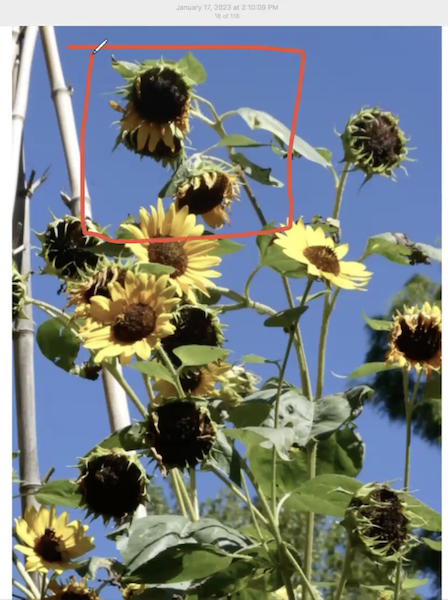
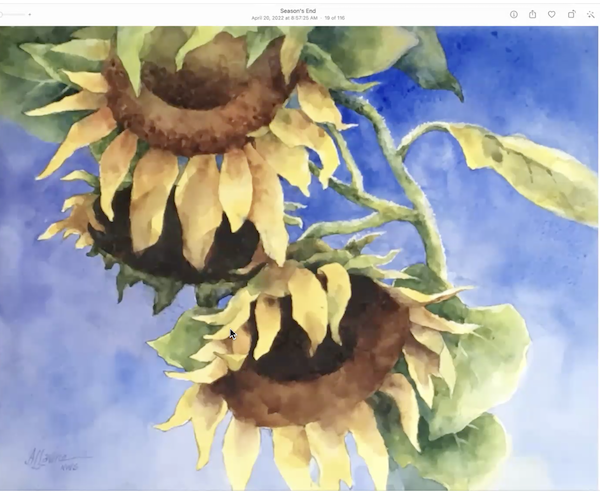
- For realism, she takes “slices” from photos or combines multiple images to create what she wants. She makes creative adjustments to elements like color and lighting to enhance storytelling and visual impact.
- For abstraction, she uses shapes, patterns, and altered values to create more expressive and interpretive artwork.
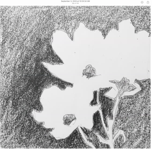
- She turns photos upside down to help the brain process shapes and textures more effectively.
- She doesn’t tape her paper to the board so she can move it and bend it. She will use bulldog clips if she needs to hold the paper in place. She makes a value study for every painting to determine the design and contrast of values.
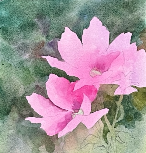
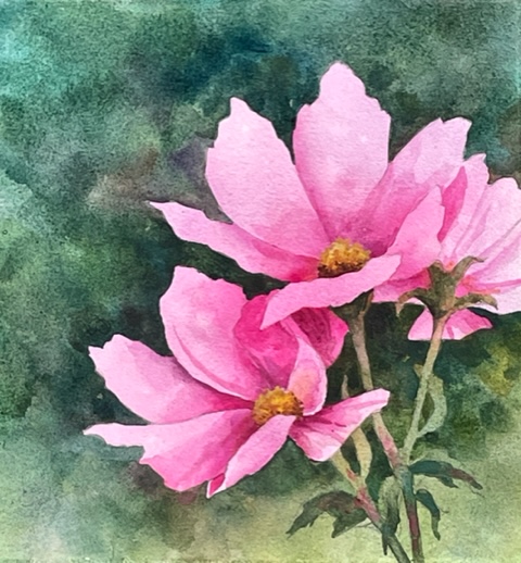
- Underpainting-
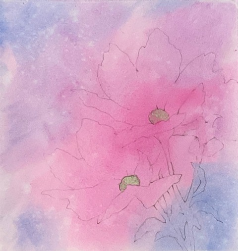
- Put the drawing on the paper
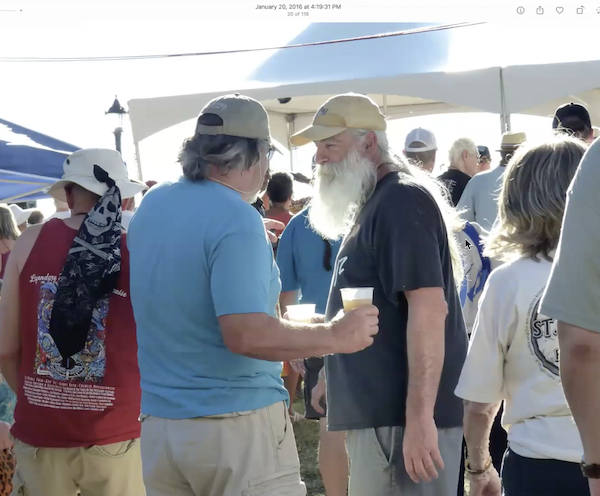
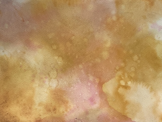
Alexis will use gesso on her watercolor paper to create an interesting surface that allows for easier paint lifting and provides additional texture. This is particularly suitable for abstract paintings. She applies two coats of Liquitex gesso with old brushes, “smearing” it on in all different directions and leaves the surface rough for more texture. Check out her short YouTube video on Gesso.
Mat and frame under glass/plexiglass just as you would for any watercolor.
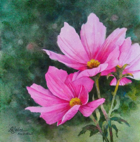
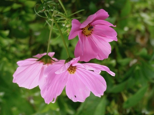
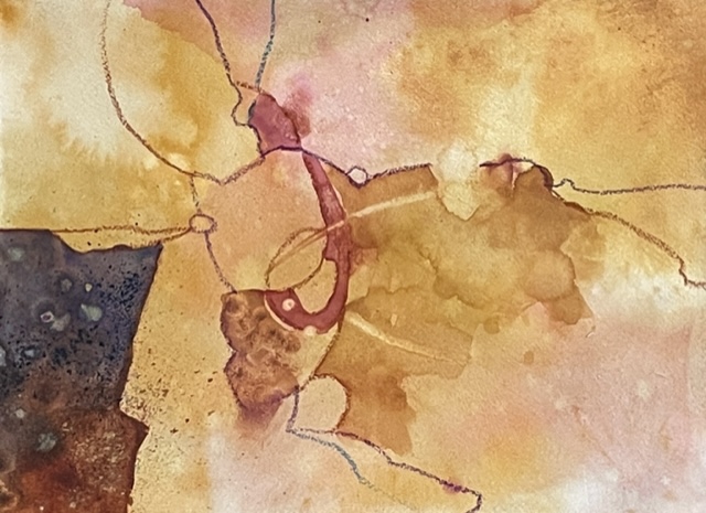
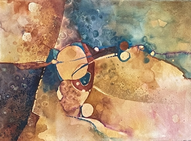
Here is an example of her process of 2 paintings from one photo:
• Tools
o Alexis prefers Silver Black Velvet and Princeton Aqua Elite round brushes for her realism paintings. She likes fan brushes for blending.
o She uses flat Princeton Aqua Elite for the abstract works.
o To lift or soften an edge, she likes dampened Princeton Select brushes, Rosemary Eradicators, or Q-tips.
o She prefers a cotton rag over paper towel.
o A spray bottle is a must, especially with the abstracts.
o She likes the Papermate SharpWriter mechanical pencil for drawing her images on the paper.
o She will also use watercolor crayons to make her drawing because they disappear. She mentioned the Caran D’ache Neocolor II water-soluble crayons/pastels.
o When she splatters an area, she blocks the surrounding surface with card stock cut with various shaped edges to control where the splatter goes.
o Fingers are a perfect tool to move paint around. They add great texture.
o Old toothbrushes are good for splattering.
o She will use masking fluid to protect an area.
• Paints
o In the realistic painting, her favorite greens are veridian for a cooler green and sap green for the warmer green. She added mauve (very dark purple) to the veridian and burnt sienna to the sap green. Cobalt violet, permanent magenta, and opera pink/Cheap Joe’s Wild Fuchsia are used for the flowers.
o In the abstract painting she used quin gold, yellow ochre, cobalt violet, green gold, and Prussian blue.
o Rather than thoroughly mixing the paints on her palette, she lets the paints mingle on the paper. Each time she dips her brush, she will gather a slightly different mix of color.
• To paint the negative space, prewet with a large brush, and paint wet on wet. For a lighter section, apply paint to dry paper.
• If the value looks perfect when it is wet, it will be too light when dry.
• She will cross edges for effect- paint outside the lines!
• Alexis loves “watermarks,” aka blooms, cauliflowers.
THANK YOU Alexis for the wonderful demonstration filled with so much information and creative ideas!
Alexis’ Website: www.alexislavineartist.com
Upcoming workshop – “Free Yourself from Copying”
April 22-24 online from 11:00 – 4:00pm