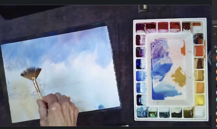
We had a great time in Alexis Lavine’s workshop “Bridging Abstraction and Realism”. We picked a photo of something we wanted to paint and learned how to paint it two ways!
Alexis encouraged us to try doing our paintings on watercolor with 2 layers of white acrylic gesso brushed on it. It can be used to recycle old paintings that didn’t work out or to use a cheaper type of acid free paper. The paper is archival with gesso and makes it easy to lift colors. Save money!
Day 1 we talked about simplifying the image, cropping some of it out, and maybe adding additional information from other photos to enhance story telling. For realism it helps to do a value study. Make sure to do your contrasts. Then wet the paper and brush in your colors. The underpainting can be dominantly warm or cool depending on the subject. Alexa works on #140 lb. cold press watercolor paper and does not worry about graphite running on the wet paper unless in a light area.
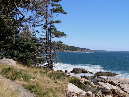
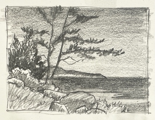
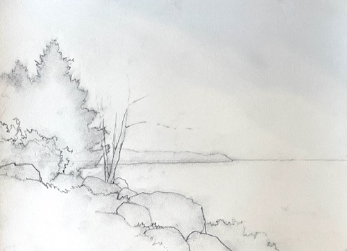
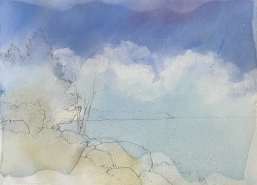
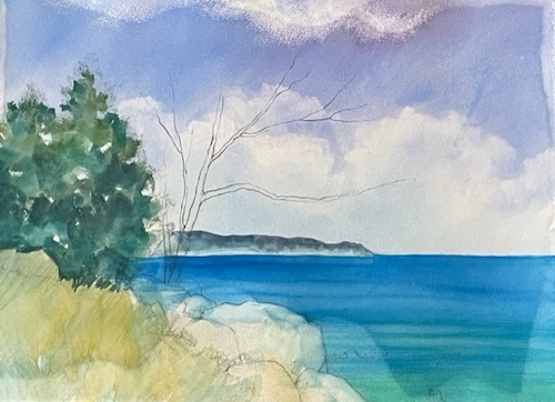
Day 2 we started our abstract paintings. Using the same photo start with a warm or cool underpainting, on #140 lb. cold press watercolor paper. Abstract paintings should be filled with expressive lines, interesting shapes, thoughtfully placed colors and intriguing textures. Limit the number of pigments and choose one dominant color scheme. Try turning your photo sideways or upside down. Sketch loosely and start painting shapes. Use any mark making tools, including your fingers.
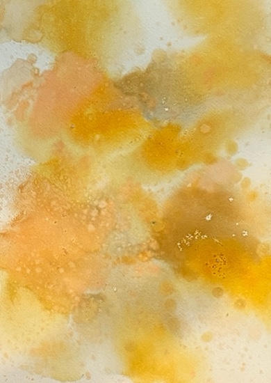
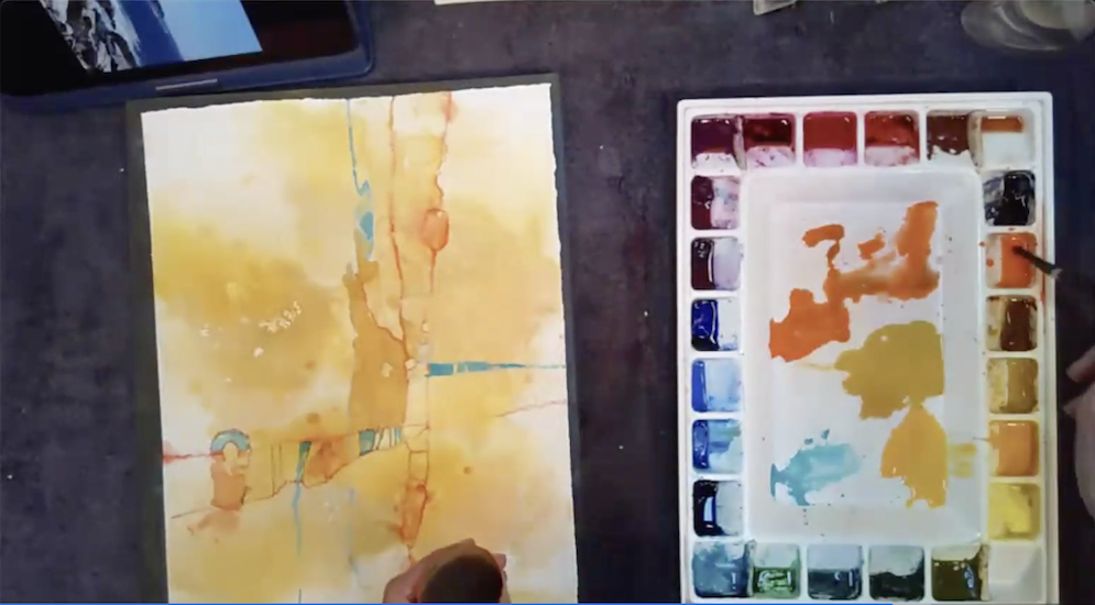
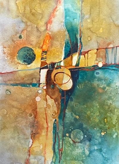
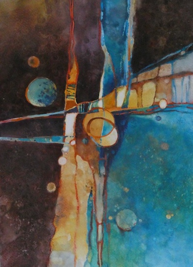
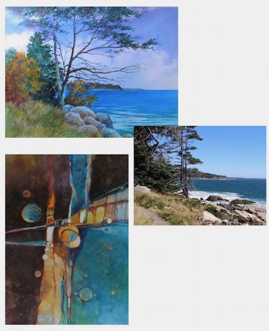
THANK YOU ALEXIS!It was a fun and educational workshop. We learned about starting with lines and shapes. For more images and information on Alexis Lavine, click on the link below: