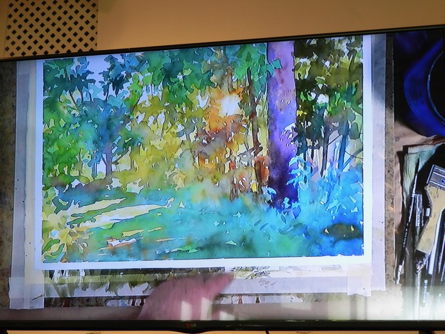
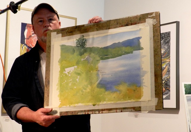
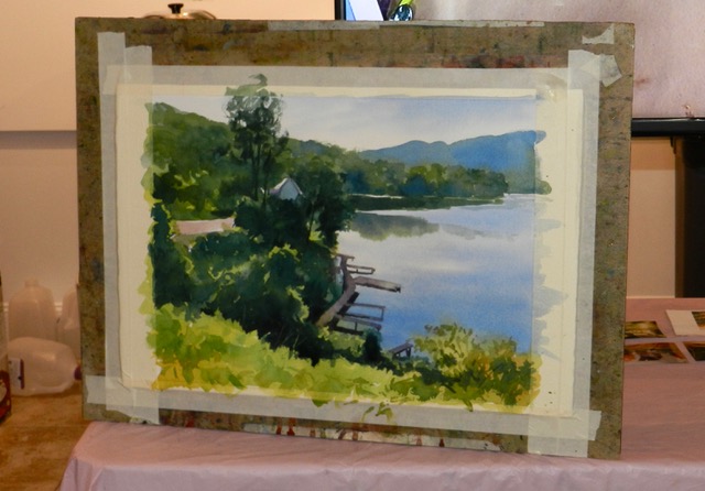
What a fun workshop, with watercolor artist Christopher Leeper! We learned so much and had a great time while learning. For instance, the first 30 – 45 minutes of the drawing is very important. Your first colors should be warmest and brightest on the white paper. Wet the paper and start painting in your large shapes. He always loads the brush from tip to ferrule so it doesn’t run out of paint. He likes to use Sanders white, #300 paper because it lifts better than Arches.
Colors are organized and thought of as warm and cool temperatures. Values and intensity of colors are also very important. Warm yellows, like New Gamboge or Indian Yellow are the colors of corn, or summer squash. Cooler yellows, like Aureolin, hansa Yellow Light like lemons or bananas.
Warm blues, like Ultramarine blue which is a dark, can be mixed with red to make a great violet. Cool blues like Thalo or Peacock can be mixed with Hansa yellow for an intense green. But, Thalo blue mixed with a warm New Gamboge makes a lovely olive green.
Thalo Turquoise is a beautiful azure blue good for tropical waters… you can make mix Thalo blue and Thalo green for this as well.
Cadmium Red Light is a classic warm red. Rose Madder and Quinacridone Red are good cools.
Permanent Brown or Brown Madder is a neutral, leans red, but does not have red in it. Can mix with Ultramarine blue to make a dark, lovely violet. His go to brown is Van Dyke brown, and replaces Burnt Umber.
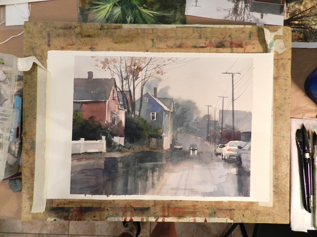
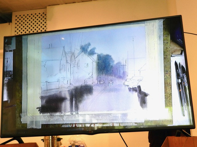
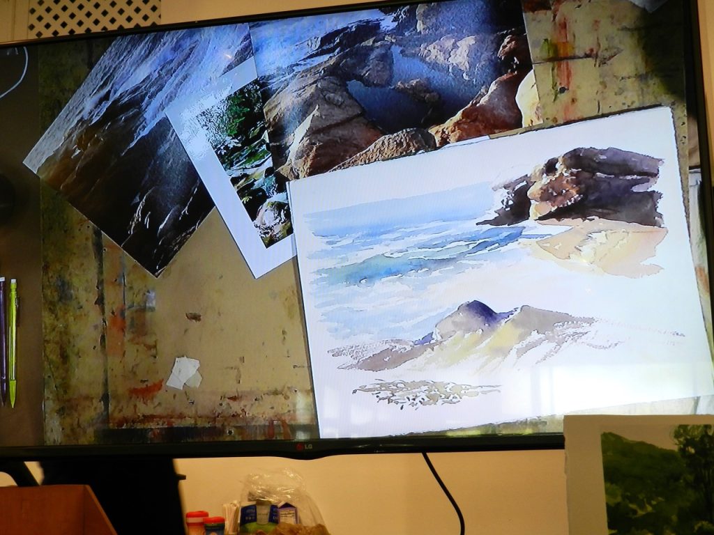
Drawing: There should be a balance between shapes… too little is boring and too many are confusing. Rainy days painting: Sketch in general lines first. The lights in the car are masked with Pebeo. Wet the painting and stroke in a lavender wash. He’s doing reflections first… Cobalt + Quin Red + Gamboge.
Some lines are suggestions and some lines are orders. If you are not sure then draw more. If you know what you’ll do then don’t draw as much. Pencil marks are OK. It shows the thinking of the artist. In a Degas painting you can see the arm of a dancer change many times, so it shows his thinking.
Earth/neutral tones: To avoid mud, one thing is to not mix the paint evenly. Use the 3 primaries and mix around the edges, to keep the color shifting. Think about the whole color palette and not the individual colors.
For the darkest colors add some Thalo blue for cools and Ultramarine for warms.
Prima Tek colors are new and interesting, the mineral colors, like Amazonite a cool green like a Thalo but less intense. Green Apatite makes a beautiful green.
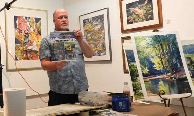
He recommends “Making Colors Sing” by Jeanne Dobie. “The Art of Watercolor” by Charles LeClair and studies of color by Steve Quiller.
Leave a Reply
You must be logged in to post a comment.